
Leah Baum
A luxury architecture & interiors studio building custom homes in Israel, shaped by the land and designed to endure for generations.
PROJECT SCOPE
Legacy Brand Identity
Custom Logotype
Brand Messaging
Luxury Print Suite
Print Production
Hebrew Typesetting
BASED IN
Israel & Michigan
YEAR
2026
BRAND VALUES
Belonging
Material Honesty
Permanence


architecture of return
For Anglo-American families building luxury homes in Israel, home is a place of belonging. Leah creates architecture informed by the land, built from authentic materials, and designed around the way families live, gather, and evolve.

CREATIVE PARTNERS
MO Creative
Brand Strategy, Messaging
Shani Jay Creative
Hebrew Typesetting

VISION
Right
Above image pair
After building her career in architecture, Leah felt called to pursue a studio of her own. For Leah, designing a home is an opportunity to impact the way people live, connect families more deeply to the land, and create spaces that will hold their lives for generations.
As she stepped into this next chapter, she wanted every part of the studio to reflect the same level of intention as the homes she creates. The opportunity was to build a restrained, architectural brand that aligned with the expertise behind her work while setting the tone for the deeply personal experience she wanted clients to have from the very first touchpoint. Like the homes themselves, the brand would be grounded in meaning rather than trends, with the longevity to carry the studio forward.

STRATEGic foundation
Left
Below image pair
At the heart of Leah Baum Studio is an ability to bridge two worlds. Leah understands the expectations of her Anglo-American clients while having the cultural fluency to bring their vision to life in Israel. The brand needed to reflect that same balance.
We approached the identity with the same principles Leah brings to architecture: restraint, intention, and a respect for what endures. Every element of the visual language was considered with meaning and crafted by hand rather than shaped by trends. The result is a brand that feels considered and enduring while defining what sets Leah apart in her market.


Logotype
Right
Above image pair
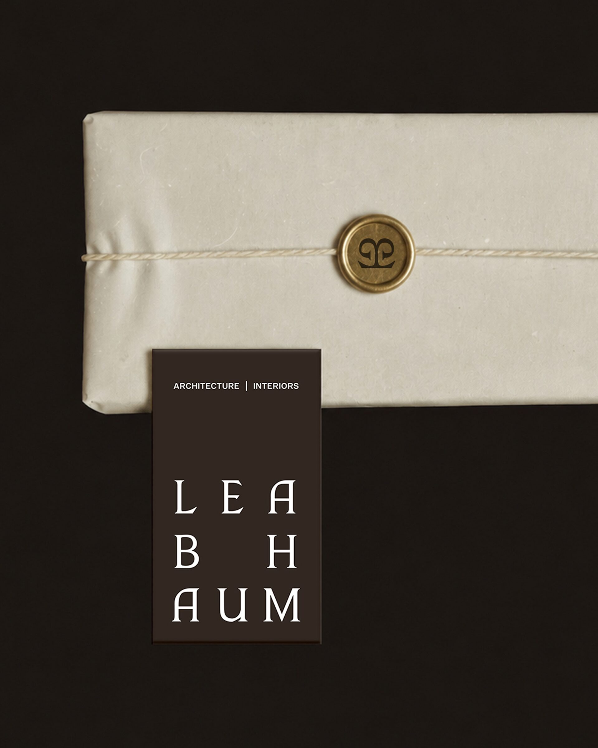
To reflect Leah's approach to architecture, the logotype needed to feel historically informed with a modern sensibility. Ancient letterforms and the permanence of stone engravings inspired its structure, while softer, calligraphic forms subtly reference Hebrew script. Every letter was drawn by hand, mirroring Leah's ground-up approach to creating one-of-a-kind homes. The result balances softness with authority, creating a mark that feels deeply considered.


Logomark
Left
Above image pair
Hebrew letterforms inspired the intertwining L and B, balancing calligraphic curves with a grounded foundation. As the two forms converge, they reflect Leah's ability to bridge Israeli and American perspectives, while a subtle tree shape draws on a meaningful symbol in Jewish culture and its connection to the land of Israel. Its continuous form reflects Leah's approach to creating homes designed to endure and be passed down through generations.


color
Right
Above image pair
Inspired by the land of Israel, the color palette complements the natural materials central to Leah's work, creating a visual language that feels lived-in, refined, and rooted in place.


typography
Left
Below image pair
A timeless serif brings warmth and character, balanced by an architectural grotesk that gives the typographic system an editorial, restrained quality.


print experience
Right
Above image pair
The print experience was designed to make Leah’s level of care tangible from the very beginning of the client relationship. Created for the onboarding of custom home clients, a welcome collection unfolded through a thoughtful narrative to assure clients that every detail was in capable hands.
The collection extended from stationery and a 40+ page proposal book to a custom linen keepsake box, layered inserts, and meaningful details that added another dimension to the unboxing experience. Tactile materials and finishes, including Mohawk Eggshell paper, linen, wax seals, and debossing, reflected the materiality central to Leah’s architectural work. Select pieces were also designed in Hebrew with right-to-left typesetting, carrying the identity seamlessly across both languages.
Bringing the experience to life required as much consideration in production as in design. We researched fabrication methods, sourced vendors and materials, developed production-ready files, reviewed proofs, and balanced quality with budget at every stage to ensure the vision could be executed with integrity from screen to in-hand.


the outcome
Left
Above image pair
The transformation gave Leah a brand that finally reflects the caliber and point of view of her work. What began as a generic DIY identity became a complete brand world, bringing together digital and print touchpoints that communicate the same level of intention her clients experience in the homes she creates.
As Leah continues to take on custom home builds in Israel, the studio now has a comprehensive brand system built to support its growth while carrying the same philosophy through every expression: every detail considered.
In Leah’s words, “She created a brand that not only represents me, but communicates the value of my work and defines what makes the studio unique in the market.”
“Beyond the aesthetic, I was looking for a meaningful partnership, and when I realized that Morgan and I shared similar values, I knew THURO was the right fit.
The THURO experience was exceptional from beginning to end. Morgan took the time to deeply understand the studio, its needs, and the vision behind it. The process was clear and organized, with a clear schedule, creative solutions, incredible attention to detail, and a sense of alignment throughout. The entire experience felt smooth, inspiring, and genuinely creative.
Morgan was able to take everything I had envisioned: ideas, values, emotions, and aspirations, and translate it into a visual identity. Working with THURO was truly a dream.”
“The brand communicates what the studio represents before a client even meets me.”
LEAH BAUM, FOUNDER OF LEAH BAUM STUDIO

our perspective
Leah Baum Studio was a reminder that some of the best creative partnerships begin with aligned values. From our design philosophies to doing meaningful work we feel called to, we approached the project with a shared appreciation for restraint, craftsmanship, and the details that give work its depth.
Throughout the project, every detail considered became a philosophy for how we approached the work itself. From the final adjustment of a letterform to the texture of a paper stock, each decision shaped the experience as a whole.
Attention to detail defines the difference. The most memorable brands are built through decisions people may never notice, but instinctively feel and trust.
← Previous Project
Next Project →
We design for the good of human flourishing. Through every project, we're committed to creating impact that extends beyond the brands we build.
Reflections on faith, family, and building work that matters.


©THURO 2026
Website made in-house
Development by MO Creative
Privacy Policy
Terms of Use