
Olivia's October
Olivia’s October is a fine jewelry–led lifestyle brand creating thoughtfully crafted pieces that honor personal stories, are returned to often, and become lasting heirlooms for generations to come.
PROJECT SCOPE
Foundational Brand
Messaging & Copywriting
Signature Shopify Design & Development
Custom Email Design
BASED IN
New York, NY
YEAR
2026
BRAND VALUES
Heirloom Craftsmanship
Ethical Responsibility
Intentional Design

designed to be returned to
The pieces we treasure most become part of the stories we carry. Worn through everyday life, they mark meaningful moments before being passed from one generation to the next.

CREATIVE PARTNERS
MO Creative
Brand Strategy, Messaging, Shopify Development & Email Design
Dawn AI Studio
AI Imagery


VISION
Right
Above image pair
After leaving the corporate world, Victoria set out to build something deeply personal. Inspired by her mother's legacy and a background in gemology, she envisioned a brand where fine jewelry wasn't reserved for special occasions. Every piece was designed as a modern heirloom, meant to be worn every day, returned to throughout life, and treasured for generations.
As Olivia's October prepared to launch its first collection, the opportunity wasn't simply to create a luxury jewelry brand, but to establish a distinctive brand world that could carry Victoria's vision for years to come.
STRATEGic foundation
Left
Above image pair
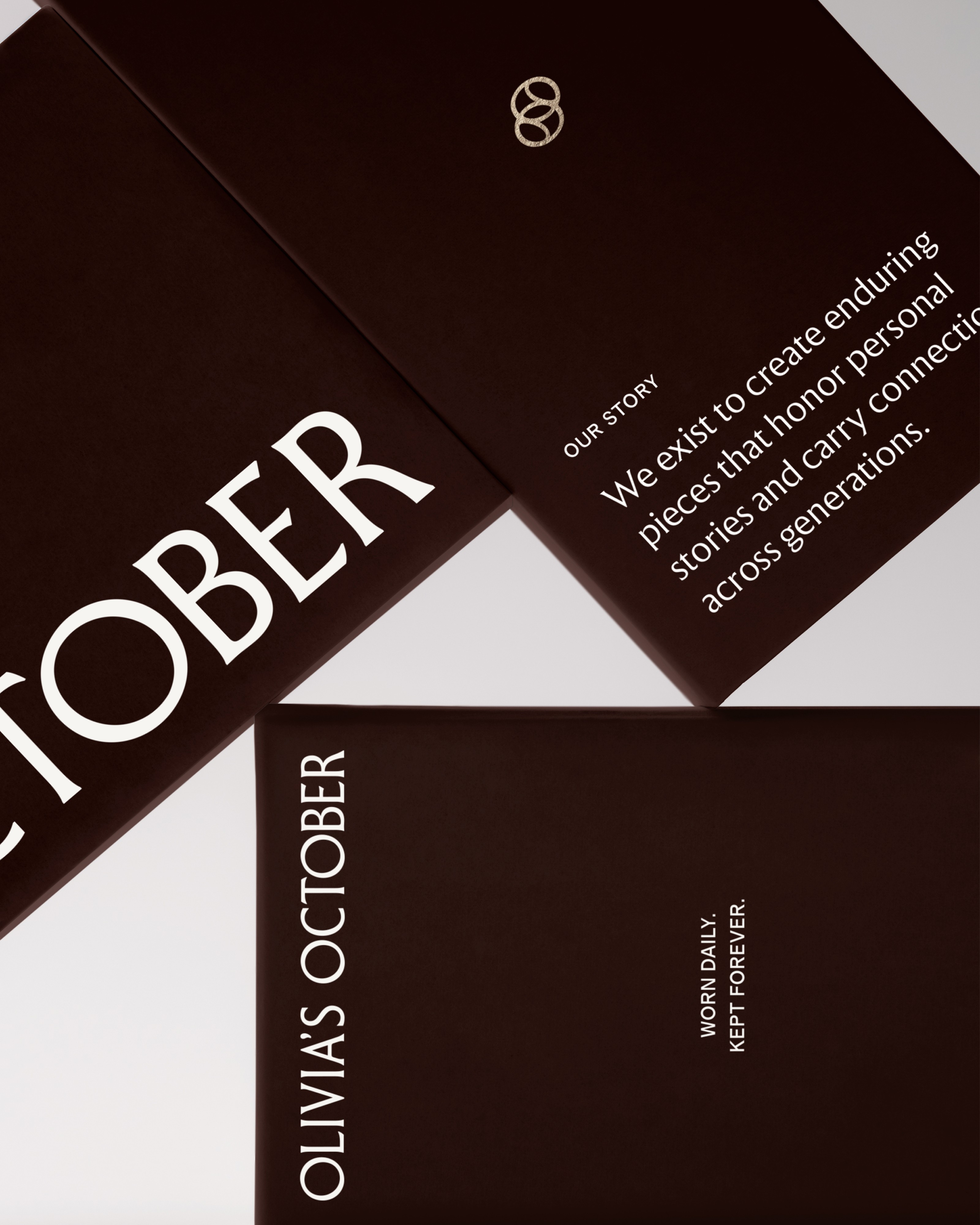
Olivia's October was built around the stories and meaning behind the pieces people wear most. Luxury was redefined through craftsmanship, enduring quality, and personal significance, creating a brand that felt refined and deeply considered.
This philosophy shaped every aspect of the identity, from the warmth of the palette to the editorial typography and soft, sculptural curves that echo throughout the visual language.


Logotype
Right
Above image pair
Created to feel both timeless and distinctive, the logotype was refined with a widened O inspired by Art Deco typography and softened letterforms that echo the jewelry's gentle curves.


Logomark
Left
Above image pair
To reinforce the idea of jewelry designed to be returned to, the logomark was created from two interlocking ovals that reference both the Olivia's October initials and the soft forms found throughout the jewelry collection. The continuous shape symbolizes pieces that become part of everyday life before being passed from one generation to the next.

color
Right
Above image pair
A warmer expression of luxury informed the palette, balancing rich contrast with warm neutrals, distinguishing the brand from the traditional black-and-white aesthetic of fine jewelry while complementing the jewelry rather than competing with it.


typography
Left
Below image pair
To bring a sense of editorial restraint to the brand, a contemporary serif paired with a refined grotesk sans creates an elevated typographic system. Meticulous attention to spacing, hierarchy, and restraint reinforces a luxurious yet approachable visual character.


Ecommerce Design
Right
Above image pair
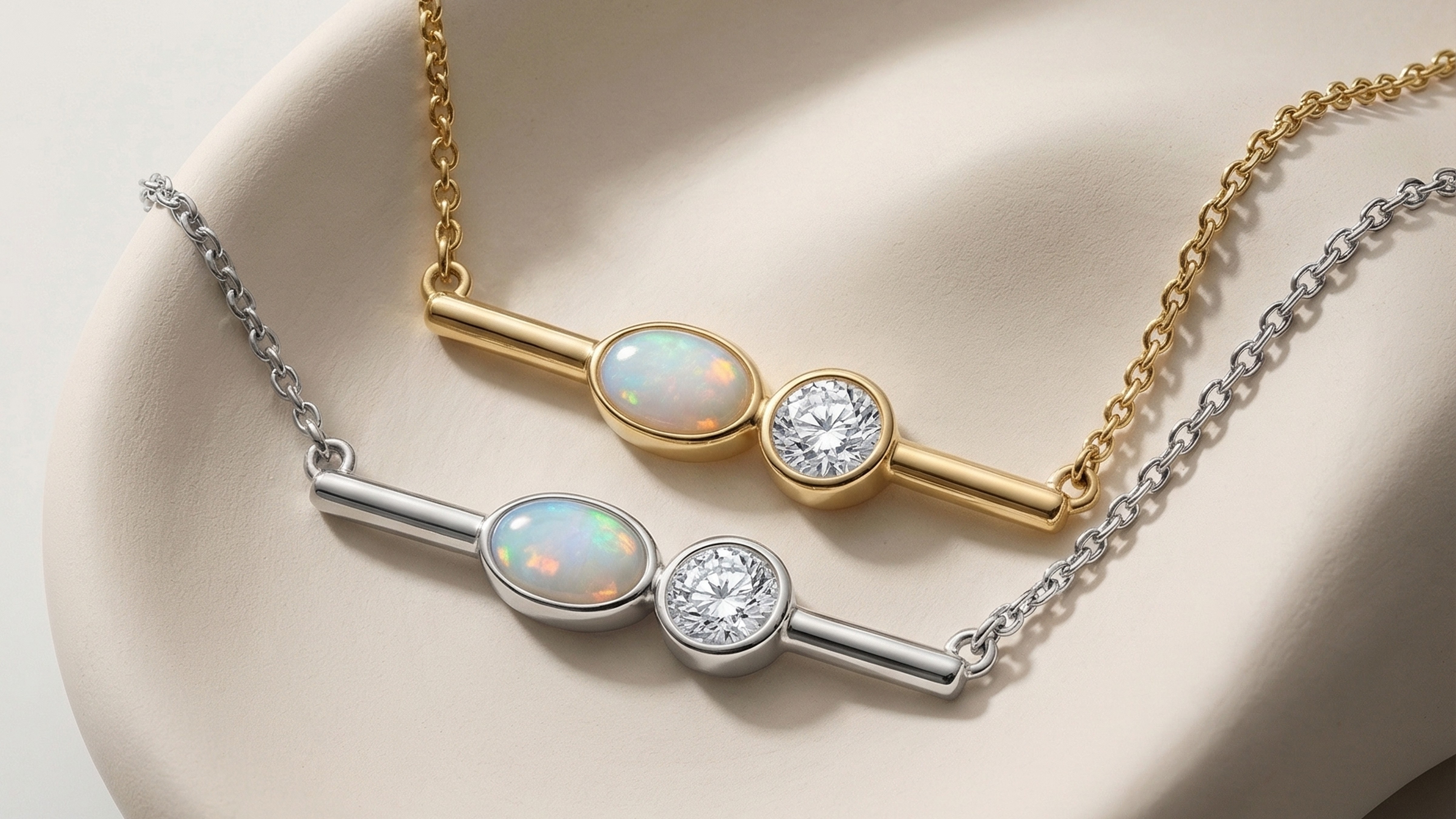
To create a luxury ecommerce experience that feels both immersive and effortless, the Shopify storefront balances editorial restraint with intuitive shopping. Strategic storytelling, thoughtful copywriting, and curated collections work together to communicate the craftsmanship and meaning behind each piece while guiding visitors naturally from discovery to purchase.
Whitespace, purposeful hierarchy, and intuitive navigation create a shopping experience that feels as considered as the jewelry itself, balancing beauty, clarity, and conversion at every touchpoint.



the outcome
Left
Above image pair
With a distinctive brand foundation in place, Olivia's October launched with confidence and a clear point of view within the fine jewelry market. The identity now provides a scalable system for future collections, campaigns, and customer experiences while supporting the premium positioning behind every touchpoint. Since launch, Olivia's October has earned recognition as a 2026 CASE Awards finalist and continues to grow through new collections, influencer partnerships, and ongoing brand expressions. Most importantly, Victoria now has a brand that authentically reflects the vision she set out to build.
“They created something that truly exceeded my expectations. They took my vision and transformed it into a brand and website that feels completely authentic to Olivia's October. What could have been a stressful and overwhelming creative process felt seamless thanks to their expertise, creativity, and guidance every step of the way.
Morgan has an incredible ability to understand the heart of a brand and translate it into a beautiful visual identity, while Michelle executed the website flawlessly, creating an experience that is both elevated and functional. Beyond their talent, they are both kind, collaborative, responsive, and genuinely invested in their clients' success.
I couldn't be happier with the final result and am so grateful to have had them as partners throughout this journey. I would wholeheartedly recommend the entire THURO Design team to anyone looking to create a thoughtful, elevated, and cohesive brand presence."
“I couldn’t be happier with the final result.”
VICTORIA, FOUNDER

our perspective
Olivia’s October reaffirmed a belief that shapes every project we take on. Craftsmanship is just as much about restraint as it is detail. Every decision was measured against a simple question: Does this add meaning, or simply add more?
The best design is revealed when every detail has a reason to exist. We believe brands endure because they’re built from meaning and conviction first, and every expression of the brand should honor that timeless truth.
← Previous Project
Next Project →
We design for the good of human flourishing. Through every project, we're committed to creating impact that extends beyond the brands we build.
Reflections on faith, family, and building work that matters.


©THURO 2026
Website made in-house
Development by MO Creative
Privacy Policy
Terms of Use