
The Pepper Pot
A needlepoint & mahjong destination bringing people together through creativity, tradition, and connection.
PROJECT SCOPE
Legacy Brand Identity
Brand Messaging & Copywriting
Custom Logotype
Illustrated Patterns & Iconography
Custom Educational Graphics
Packaging & Print Collateral
Retail Signage
Social Media Design
Email Marketing Strategy & Design
Custom Shopify Design & Development
BASED IN
Barrington, IL
YEAR
2026
BRAND VALUES
Community
Hospitality
Tradition

gathering around tradition
Through needlepoint and mahjong, The Pepper Pot creates a place where longstanding traditions are experienced together, shared across generations, and carried forward.

CREATIVE PARTNERS
MO Creative
Brand Strategy, Messaging, Shopify Development & Email Design
Vanessa McCormick
Photography

VISION
Right
Above image pair
Crystal set out to launch a business inspired by the traditions she had grown up with. As needlepoint and mahjong found renewed interest across generations, she envisioned more than a retail store. The Pepper Pot would be a welcoming place where people could gather, create, and connect, regardless of age or experience.
As The Pepper Pot prepared to open its doors, the opportunity was to build a distinctive brand that honored these longstanding traditions while making space for a new generation to experience them. The goal was to build a brand world that could grow alongside Crystal's vision, from a thriving local community to national recognition.

STRATEGic foundation
Left
Below image pair
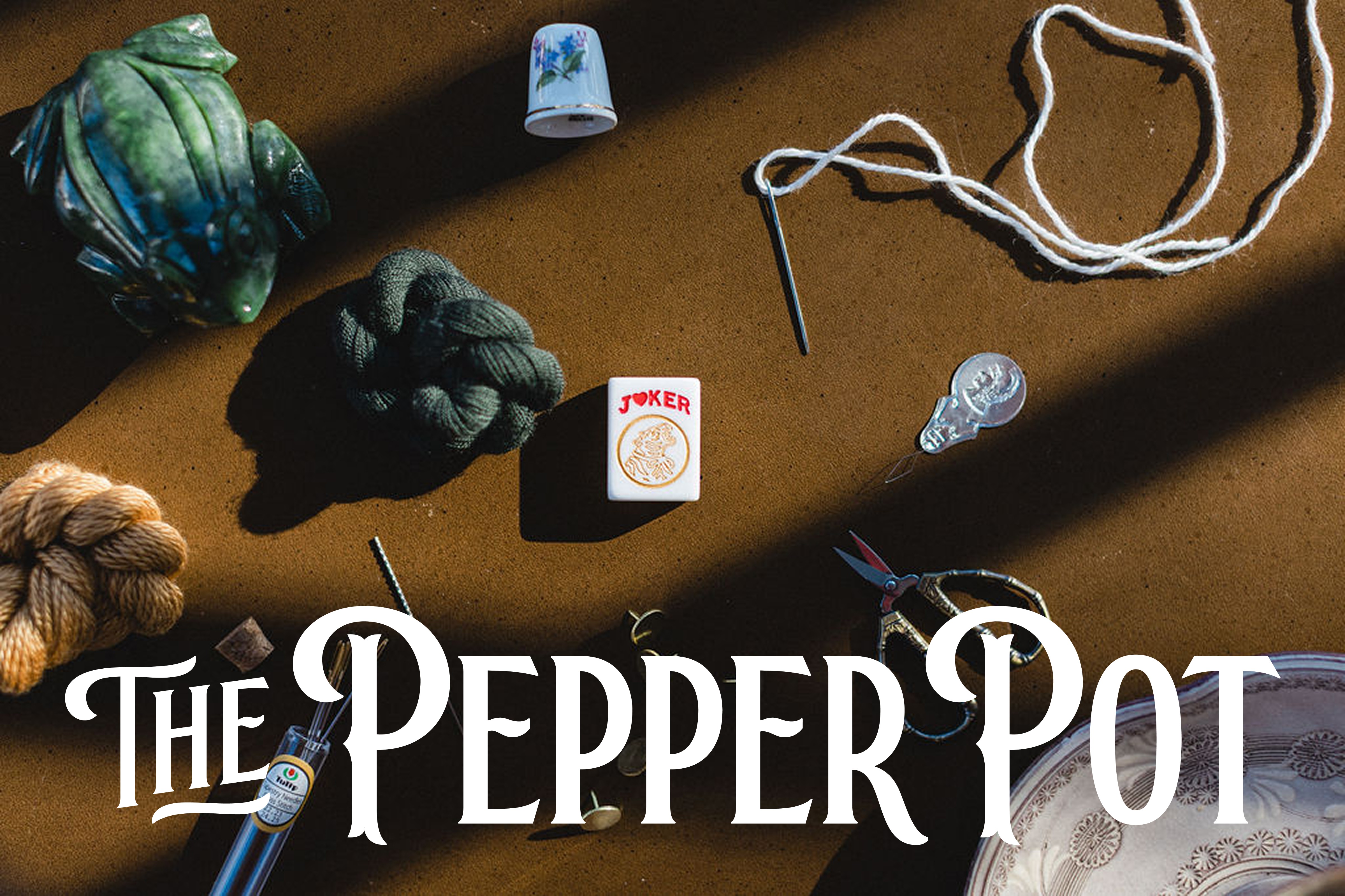
The Pepper Pot was built around the idea that everyone is welcome to the table. By bringing needlepoint and mahjong together, the brand needed to connect with experienced enthusiasts and curious newcomers alike, creating a world where tradition could feel relevant to a new generation.
Rather than feeling like a typical craft store, we approached The Pepper Pot through the lens of hospitality. Every detail needed to feel warm, timeless, and intentionally curated. A modern-traditional sensibility brought together rich color, Victorian-inspired illustration, and storytelling, creating an identity that felt grounded in the past while distinctly its own.


Logotype
Right
Above image pair
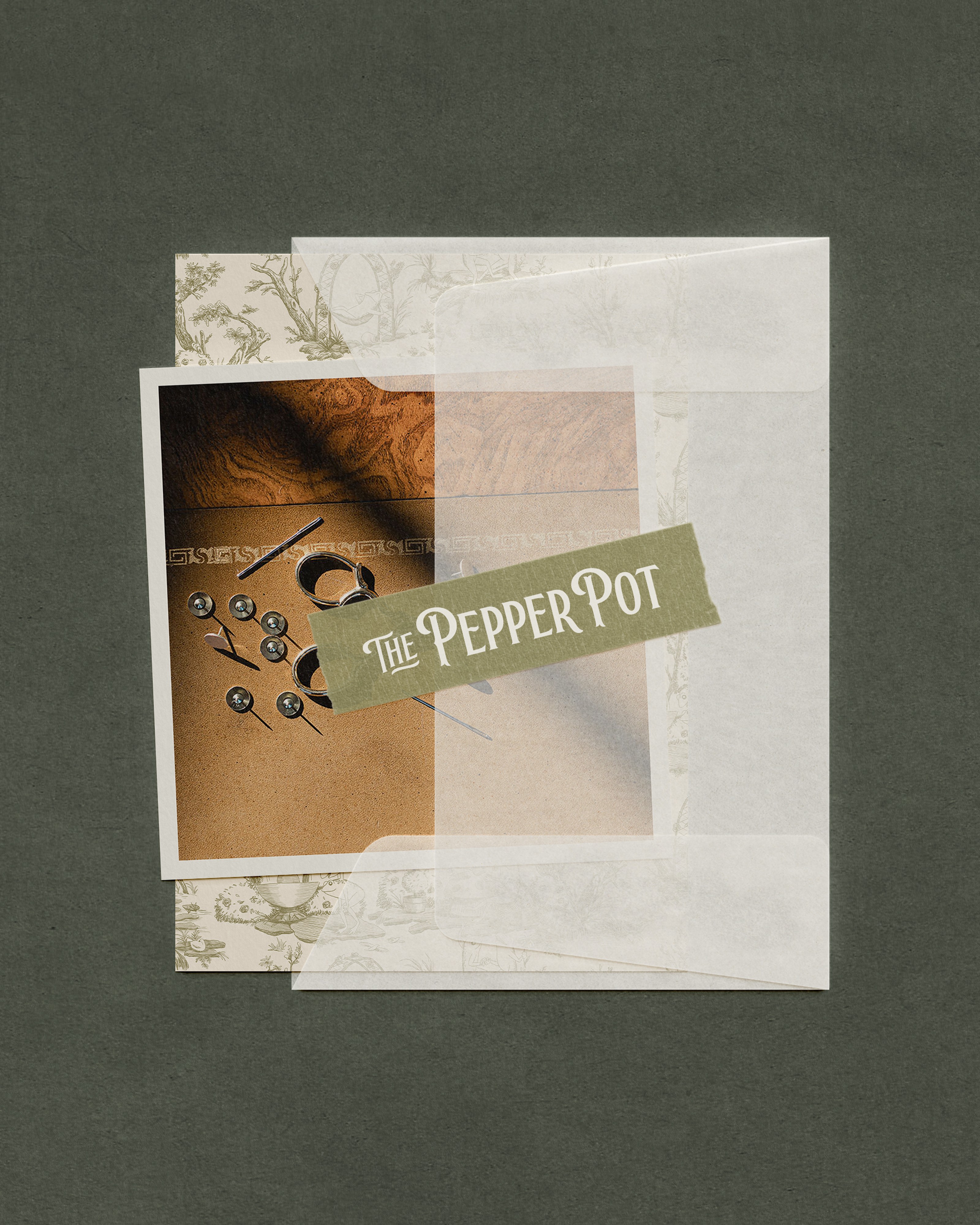
The logotype reinterprets elements of Victorian typography through a modern approach. Narrow letterforms and distinctive spur details create a sense of heritage, while the curved E, mirroring the teapot spout, brings continuity and warmth. The result feels refined and memorable, rooted in the past and reimagined for today.


Logomark
Left
Above image pair
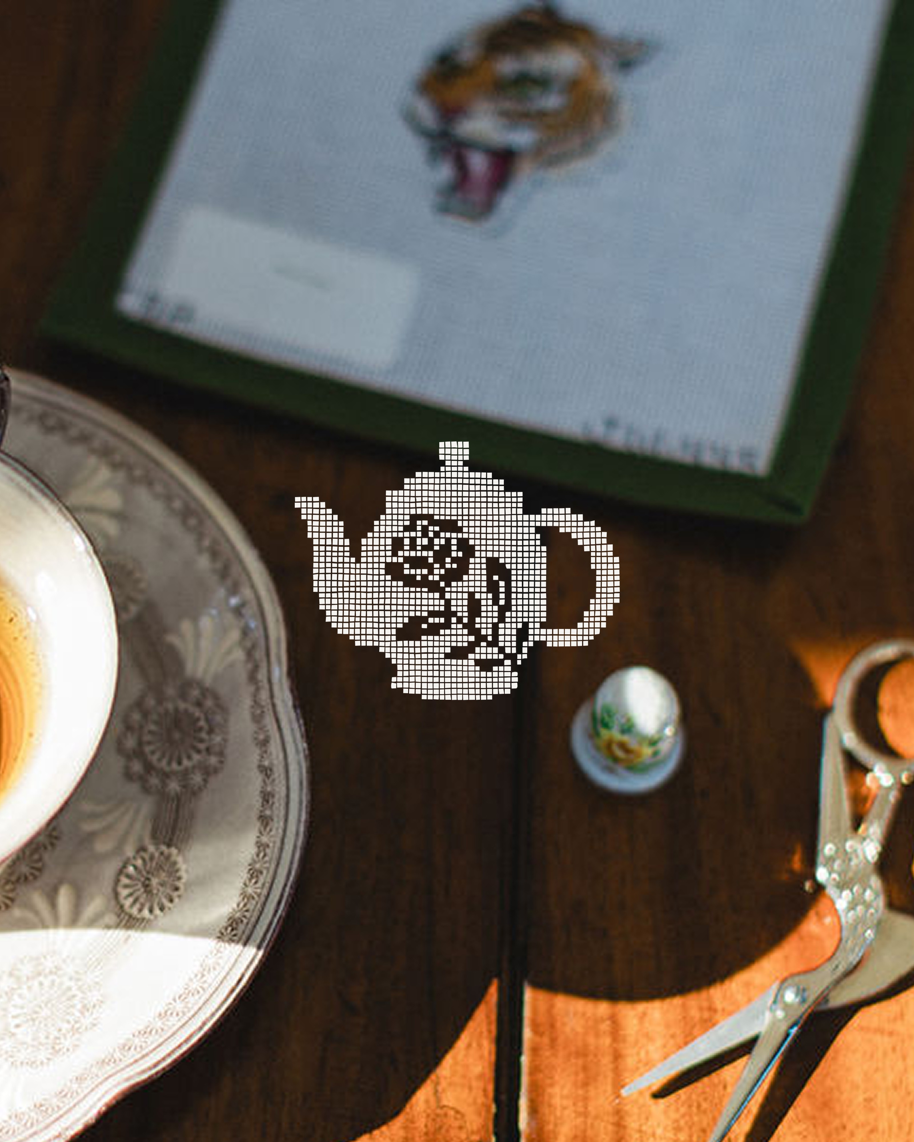
The English teapot plays on the idea of a melting pot, representing The Pepper Pot as a place to bring people together. A stitched pattern subtly references needlepoint, while the handle echoes the curve of the P, creating cohesion throughout the logo family. A rose detail draws from the English garden influence, adding character and dimension to the mark.

monogram
Right
Above image pair
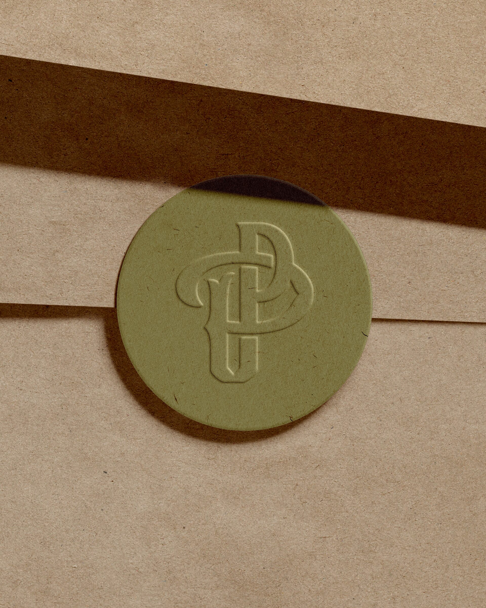
The monogram brings together the two P’s in The Pepper Pot through interlocking forms that reflect connection. The composition subtly references the pilcrow, a mark used to signal the beginning of a new paragraph. This idea reflects The Pepper Pot’s approach to carrying familiar traditions forward while writing a new story for the next generation.


color & Typography
Right
Above image pair
The color palette balances warm tones with richer heritage hues, bringing depth and character to the brand. The palette creates a more unexpected expression while still feeling timeless and refined.
A contemporary calligraphic serif paired with a utilitarian vintage sans balances expression with structure. The combination brings a human touch and heirloom quality to the brand.


illustration
Right
Above image pair
Inspired by traditional Toile de Jouy, a custom illustrated pattern reimagines the historic Victorian style for The Pepper Pot. The frog serves as a brand mascot, referencing frogging in needlepoint, while English garden elements add depth and character. Illustrated scenes of gathering, creating, and slowing down reflect the brand’s values of community, inclusivity, and hospitality.
physical experience
Left
Above image pair
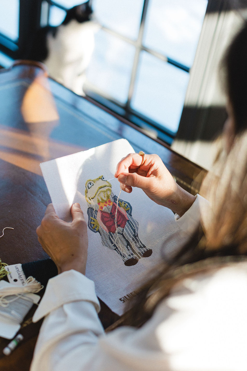
The Pepper Pot’s identity extended into every physical touchpoint, from the storefront to the unboxing experience. Custom packaging, shopping bags, branded cards, and a gifted stitch booklet brought thoughtful details throughout, while custom stitch graphics transformed familiar needlepoint techniques into branded educational content.
From vendor sourcing and production files to proofing and final execution, we oversaw the print collection to ensure each piece remained true to the original vision.



shopify design
Right
Above image pair
To translate the warmth and discovery of The Pepper Pot into a digital experience, the Shopify site was extensively customized to feel just as considered, curated, and welcoming as stepping into the store itself. Custom layouts, branded interactions, and layered storytelling pushed the experience far beyond the constraints of a traditional Shopify theme, creating a digital world distinctly their own.
With a robust catalog organized by category, designer, experience level, mesh size, and product type, customers can intuitively explore the collection and find exactly what they need. Product add-ons make discovering complementary items a natural part of the shopping experience, while integrated event booking and educational content invite customers to engage with The Pepper Pot beyond a purchase. Together, these touchpoints create a digital destination for products, learning, events, and community.


the outcome
Left
Above image pair
The response to The Pepper Pot was immediate. On opening day, customers lined up outside, some having traveled from other states to experience it. What began as Crystal’s vision for more than a retail store quickly became the gathering place she imagined, with regular events, weekly classes, and a growing community around needlepoint and mahjong.
Since launch, The Pepper Pot has continued to grow both in-store and online, expanding its team, event programming, and ecommerce presence. The identity has gained recognition beyond the needlepoint and mahjong community through organic sharing and an enthusiastic response to the brand.
Most importantly, the brand now reflects what Crystal set out to create: an original expression of heritage, craft, and connection with a point of view entirely its own. In Crystal’s words, “I feel like everything is aligned with my vision and brand story.”
“I have ‘thruo’ly enjoyed working with you through the branding, packaging, and website aesthetic design. It has definitely brought our vision of The Pepper Pot to life and more. Your branding talent is extraordinary, and we wholeheartedly recommend it to everyone.
The number of compliments we have received from individuals, even those not related to the needlepoint and Mahjong community, has been overwhelming. We have definitely recommended your work to everyone who has reached out.”
“It brought our vision of The Pepper Pot to life and more.”
CRYSTAL, FOUNDER OF THE PEPPER POT

our perspective
The Pepper Pot became a true labor of love and a reminder that originality often requires refining beyond the first or most expected solution. Building a brand this layered meant considering how countless individual decisions could come together to create something unexpected, cohesive, and full of character.
Often, it’s the details that are rarely noticed but deeply felt. From the intricacy of a hand-drawn Toile de Jouy pattern to the character of a single letterform, even the smallest choices influence the way a brand is perceived. When that level of intention carries through every touchpoint, a brand becomes more than something people recognize. It becomes a world people remember.
← Previous Project
Next Project →
We design for the good of human flourishing. Through every project, we're committed to creating impact that extends beyond the brands we build.
Reflections on faith, family, and building work that matters.


©THURO 2026
Website made in-house
Development by MO Creative
Privacy Policy
Terms of Use